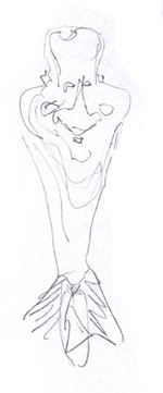
Caricature of Mark Rosen: Version two - going for a cartoon "rough" outline that captures all the general shapes
In this quick rough version,
I like the overall shape captured in this sketch. The cheeks are
prominent, the nose is dominant, the mouth is more asymmetric -- and much
tineier -- than in the first version. The forehead, neck and cheeks really
capture the overall "waiting to be caricatured" look hidden in
the photo. By adding sloped down shoulders and a taper to the neck itself,
we've avoided making him look fat -- which if we drew in just a normal
length neck -- would have happened had we left those chubby cheeks on a
normal length neck.
It's also apparent the slightly upside down
pear shape of the forehead with a much diminished hair mass works too. At
least I think so. Make sure you scroll down the page further so you don't
miss the larger copy.
The original drawing is about 5 inches
tall. All those little gray and white streak lines / grainy leftover stuff
you see in the scan below are from erasing out the background grays
brought in with the scan. (Done on Photoshop.) Amplifying yeh contrast in Photoshop
also accentuates the grays...but that's not what's important here...:-)
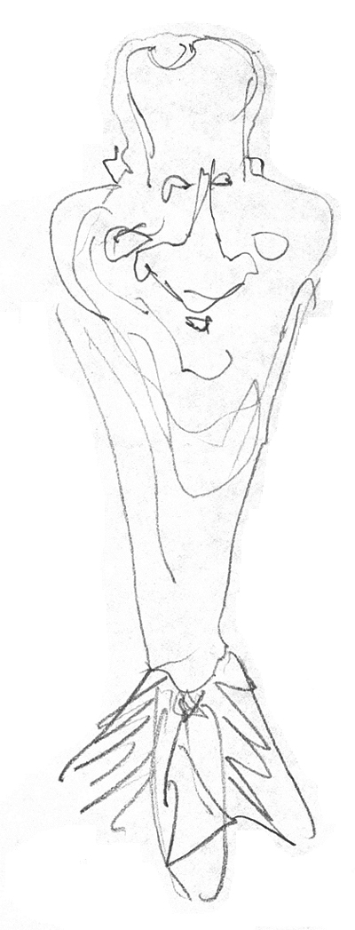
The line drawing that captures the
caricature hidden in the photo
|
Kasbohm & Company's
Drawing-Faces-and-Caricatures-Made-Easy.com
and
YouCanDraw.com
© Copyright, All rights reserved 1997-2005
|