|
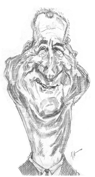
Caricature of Mark Rosen: Version four -
|
| Now we're getting there. We're in the ball park. Look at this too: how many tries have I run through thus far to get here? At least four, right? So don't beat yourself up for not getting it right the first time! And check out the Randy Quaid "freebie" we got out this effort. I was shooting to get a likeness of Mark Rosen and ended up getting a really fun version of Randy in the making. What a deal. And not only that, this fourth drawing is really starting to capture a few things that are peculiar to Mark...more below... |
The eyes are starting to shape up: notice how the down slanting upper lids begin to work? Now the real trick would be to exaggerate the lower lid as it covers the colored part of the eye -- adding more of an upside-down-"U" shape to it works well to capture happy eyes. The hair seems to fit his age and the actual look of the his hairline in this version. Te shape of the forehead works well. Notice this small feature too: the shading in the hair is just from me taking a finger and smudging right into the hair line. Very simple little move that really adds depth. The cheeks and dimples in this version could have been made a little more contrasty to make them look more roley-poley but overall they work. The neck hits it I think: maintaining an athletic length and shape to it eliminates any fat looking tendency big cheeks might give to the face. And that's a good general guideline too: if you want to keep someone athletic looking and they have a chubby face, give them strong, longer yet thick neck with well delineated muscles. Plop a chubby face on a thick neck and you get a Jobba-the-hut fat look. You can get around that. So to speak...bad pun. I think when I do this again, I'm going to make the nose much broader to even more dominate the mouth. Here's a curious finding -- a short little
quiz for you: what is it about the mouth that makes it look more John
Wayne-like than Mark Rosen-like? Scroll down below the big picture
for the answer...
For me, it's the shadow at that upper curve on the right side of the mouth (left side of the mouth as you look at the picture). It's a kind of triangular shadow shape, and more over the upper side of the upper lip than anywhere else. In fact I had to look at the mouth closely before I could actually put a word on what it was that was John Wayne like. Remember, we tend to be aware of shadows on a much more subtle, almost unconscious level than we are of "hard" features like the nose, teeth and eyes. Now if you ever do a John Wayne drawing, remember this little tip :-)
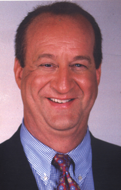
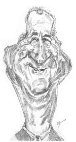
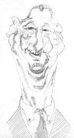
Comparing the three "working" views of Mr. Rosen:
Kasbohm & Company's Drawing-Faces-and-Caricatures-Made-Easy.com © Copyright, All rights reserved 1997-2005
|