|
Drawing Karl RoveDrawing Karl Rove - and caricaturing him - depend on seeing the obvious and subtle. Do you know what to look for?
Caricature and Drawing Newsletter for November, 2005 |||||||||||||||||||||||||||||||||||||||||||||||||||||||||||||||||||||||||||||||||||||||||||||||||||||||||||||||||||||||||||||||||||||||||||||||||||||||||||||||||||||||||||||||||||||||||||| Your November 2005, YouCanDraw.com Communiqué ||||||||||||||||||||||||||||||||||||||||||||||||||||||||||||||||||||||||||||||||||||||||||||||||||||||||||||||||||||||||||||||||||||||||||||||||||||||||||||||||||||||||||||||||||||||||||||
Howdy all, Can you believe it's already the Holiday Season? Unbelievable. I know you're all busy so we'll dive right on in to your holiday diversion: drawing Karl Rove. Err, caricaturing Karl. Seems sir Karl has had a spate of bad luck. (Again, I'll hold way back on my political opinions, even though I have the editorial right to cut loose at any time. Hey, that's what caricature is all about, right? :-) But in the spirit of the season I'll be nice. Sort of. Any way, here's three miniviews of three Karl Rove caricatures
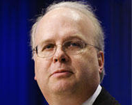
So what makes good old Karl caricaturable? (Before I begin, let me say this: I'll be ginvig a pretty superficial treatment of what makes Karl caricaturable today. In upcoming issues we'll look at each feature in closer detail. Yes, that could take some time, but I want to keep these newsletters short and impactful, so today we'll go roughshod down the list of things that caught my eye on first glance - and looked ripe for caricature.) Starting at the top. Literally. Here's a picture off the web of Mr. Rove:
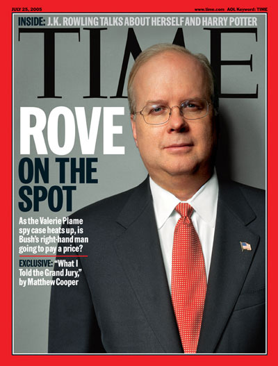
Here's another great picture of Mr. Rove -- probably a copyright infringement to have posted here on the site, but I'll leave it up as long as I can. 'Course, if I link it to Time magazine, it's probably much less of a problem. (Please do a Google Image search and you'll have more photos than you can shake a stick at):
Overall, the foreheads also pretty looming, or at least that's my perception. Shazam: that's caricature fodder. Ok, the thin white hair. That goes down on the mental list of things to exaggerate too. Next: the Eyes. There's a level of concern to note in the very subtle shadows above the eyebrows; remember, there's some pretty fine musculature under the skin that jumps and twitches and bundles up at an unconcious level. Their every move ruffles the shadows and skin texture in some subtle way. The eyes themselves have somewhat heavy lids, and noticable shadows under the lower lids. In fact the lower lids almost look dark - like a smoker's dark, or an ongoing allergy. I'm just guessing here - and reading in a bit. I have no knowledge of either. Of course, lack of sleep will do both. The glasses are relatively subtle as far as glasses go - thin rims, very subtle shadows on the cheeks below. The shadows from the glasses (note how they range down the cheeks especially on the cheek to the right as you look at the picture) really add a feeling of depth - that the glasses are supported in space off the nose and face. They're easy to miss (the shadows), but if look close you'll notice them. And this is a good opportunity to point out the light direction: is it obvious from which direction the light is coming from in the Time picture above (or either picture for that matter?) Ok, did you guess? Yes, absolutely, it's coming in quite strongly from the left casting the strongest shadows on to the right side of the picture. The Nose. The nose is relatvlety smallish. and if you look close there's some fine geometry at the very tip of the nose as well. Look at the central highlight on the middle of the nose and note how dark the shadows get to the left and right of the central highlight and just below the base of the nose. Also note the shadow the nose casts to the right over towards the cheek. One other thing to mention the nose has the majority of it's mass right at the bulbous tip. This is an important note to check off on your exaggeration list even if you're going to make the nose small in relation to the rest of the face. To reckon the overall dimensions of the nose with the rest of the face, you've got to envision the horizontal landmarks: where the bottom-of-the-nose line falls in relation to the middle-of-the-mouth and the middle-of-the-eye line. Recognizing the geometry and the subtle distances between those landmarks can defineltly influence your drawing. (Don't remember those landmarks? Look 'em up in monster Lesson 15. This link leads you to he flash lesson on horizontal landmarks.) The nose dove tails to the narrow mouth via the naso-labial folds ( these are lines that form the apron of the upper lip...don't recall these? Fire up your sourcebook, open the search function and type in these terms. You'll get all sorts of answers...and in fact, you could Google it these days and get an amazing array of references :-) Of note about the lips: the upper lip is fairly narrow while the lower lip is much fuller in comparison. The chin is actually quite square edged - and arises out of Mr. Roves rather fleshy doulbe chins. The cheeks: this is a great exercise / lesson in shadowing and subtle pencil technique: there are so many interesteing planes, highlights, shadows and texture hidden in the cheeks. Balancing the light and deep shadow areas from left to right side of the picture takes a lot of stepping back from your picture and doing some real objective sighting. But it's in these more complicated light folds and planes that for me, the real challenge - and pleasure of drawing - is found. Like the cheek shadows, the neck and Adam's Apple are represented with the same kind of repititious but subtle pencil hatching and fine repititious lines.
Check out the larger pictures below So take your time looking over the next three pictures, and see if you can spot the things we've talked about - and compare them to the photos above and see if you can't spot your own subtle shadows and highlight pattrerns -- all the while maintaining an exaggerated resemblance. Like I said earlier, we're going to go through a more in-depth look at each of Karl's features in upcomng issues. This'll get you cued back into what makes a caricature work - and better, you'll see again what you're to look for when drawing anybody.
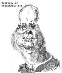
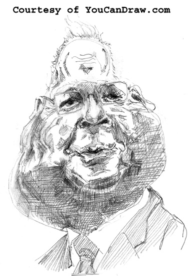
The first drawing I like the small forehead and the big cheeky jowls and I love the way the detail, fne lines, light reflections and shadows work around the mouth and the naso-labial folds. But, it just doesn't really look that much like Mr.Rove. I don't think so any way. And I can say that: it's my drawing :-)
Drawing number 1
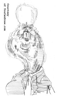
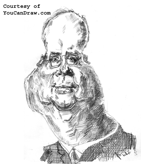
Drawing 2 Now we're getting there: this is starting to work: the forehead is bigger, the eyes and glasses relatively smaller, the mass of the lower face good sized but not overpowering; the NECK is starting to work.That was the accomplishment: building a neck with mass that contained this sort of "off to Alaska" look...(you might have to think abouot that: hint - think of the actual state of AK it's shape). The upper lip works as a much better likeness too. The hair is more Karl also.In all of these drawing, note the use of parallel lines in and around the darkest shadows. It adds so much depth - and it's actually similar to what I think I'm seeing in actual skin these days :-) Take a look:
Lastly, drawing number three I was going to put this one up first and try and pass it off as the first drawing but that would have been dishonset. No, this was the third in the series and I did it in probably three minutes. It's probably 6 inches tall (the other two are closer to 10 or 11 inches tall). And quite frankly, if I were to spend some time working this basic shape up in fine detail, I think it could really work! The eyes / nose / mouth / glasses are the center of interest and as simple and rough as they are, they work. (I think.) I like the cylinder suggested in the apron of the upper lip. That's the best part of the picture to me. What's important to recognize here is this: I "arrived" at this picture because I spent a certain amount of time working through and really observing the features in detail before this third one sort of poped out. Careful obsevation and the recording of that observation (i.e. drawing), is what opened the doors.
Drawing number 3
Assignment Any way, keep on drawing -- and if I had an assignment, it would be to work this third drawing to ever crazier exaggeratons while maintaining some kind of recognizable likeness. Test and retest. Draw and redraw. That'll quell the fear. Until next time...Happy Holidays!
Warmly, Jeff
Kasbohm & Company's Drawing-Faces-and-Caricatures-Made-Easy.com © Copyright, All rights reserved 1997-2005
|