|
An Attempt At Caricaturing
|
Caricature and Drawing Newsletter for January, 2007 January 2007
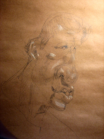
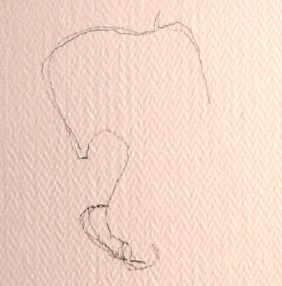
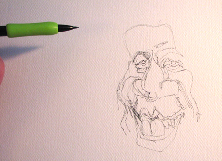
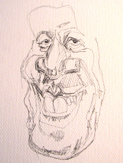
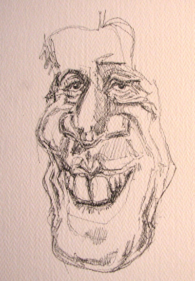
Howdy all, Starting off with a quick side note. I think I mentioned in the last ezine how I was going to show you a great little technique for getting a different look using colored paper. Well I started doing a few drawings and I realized as I photographed them, the paper was a little too dark to get a reasonable picture even after touching them up with Photoshop's brightness and contrast functions. But I will show the results of one quick sketch. It's a really rough (and barely recognizable) likeness of Peyton Manning (the Indianapolis Colts football team quarterback). Rough yes, but you'll kind of get the idea:
You can see the same approach in this Flash Lesson. There we used a penciled-in "ground" we erased out for highlights. The "ground" is basically the color of whatever kind of paper or cardboard or garbage bag or rice paper you're drawing on. If you use the side of a pencil to color over the entire sheet of paper you've altered the ground. In the Flash lesson above, the pencil shading acts as the ground. The ground acts as the middle tones. The beauty of colored paper is the middle tones are already colored for you :-) Yes, I know I said it doesn't really look like anyone. But that's the nature of making any kind of art: sometimes you're on it, sometimes your 'e not. (And quite frankly, I'm a little off kilter in both of today's results. (Or maybe I don't draw enough anymore :-) But does that stop me from drawing? Sometimes yes. But that doesn't mean I'm bad caricaturist, right? And same for you :-) A writer doesn't always write great stuff, in fact, ask most writers and they'll tell you the same. But that's why writers rewrite, because eventually they'll "drop in the pocket".
Find the pocket "Drop in the pocket" is an old cliche funk musicians used to describe how it felt to be "in the groove", or how when everybody found their slightly-off-center-but-on-the-fraction-of-a-beat syncopated place in the rhythm of a song, it all came popping together. Why even the best baseball players only bat 350 or 400: they pop-up, ground out or strike out 66% of the time. So, likewise as a caricaturist or visual artist, you just keep at it. That's it. Period. Besides there's way too much emphasis on product and not enough on process these days when in fact as an artist, process is what it's all about. Yes, your product is what a buyer appreciates about your art but when product is the sole focus, you'll get frustrated. Enjoy the process as they say.
Back to the drawing above A couple more comments about the drawing above. I used Borden and Riley #840 craft pad paper I bought at Dick Blick. It's a little on the dark side for plain old pencil to show up. Better for charcoal. But here was the idea I wanted to convey: it's great practice for getting pictures to pop off the page using 3 colors: you use the color of the paper for middle tones, your pencil or charcoal for the darkest tones and for the very carefully picked highlights, you use white chalk or a light earth tone pastel. The effect is kind of like those paintings done on black felt. They're Fun. And you can always try to do an Elvis and sell it on the street corner :-)
Senator Norm Coleman OK, back to today's 2nd drawing. We're gong to lampoon Minnesota Republican Senator Norm Coleman and use him in a caricature drawing lesson. Now I've met Norm once, and he was a really nice guy - even if I don't agree with his politics (and even if he's been a flip-flopping opportunist ...ok,ok, I'll keep my opinions out of this). I'll say this too - I missed the mark on his drawing too :-) And that's OK. Do I get in huff about that? No. I just draw another picture :-) So you might be stuck with seeing Mr. Coleman through a few issues :-)
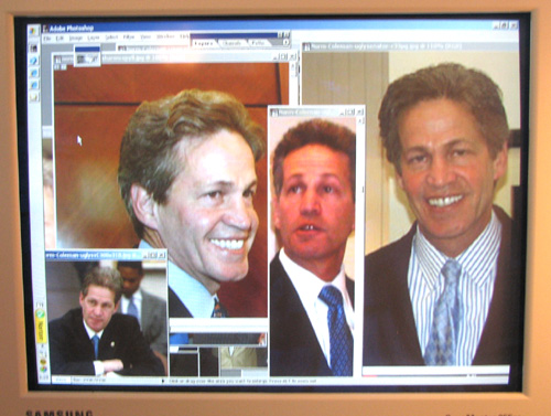
So let's do the set up on Senator Norm Coleman 1) I've collected a whole bunch of pictures off the web (Google image search). I've opened the best of them in Adobe Photoshop. See my screen right here:
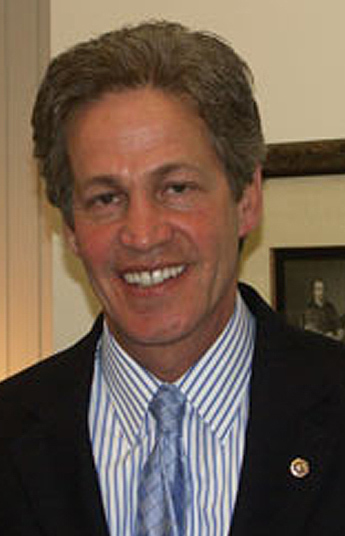
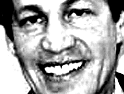
So that's what I'm looking at - that's my subject material. 2) I've got my drawing pad supported on a drawing board leaning on the table my computer sits on. Here's the picture I'm going to work mostly from:
3) the paper I'm using is some inexpensive Strathmore #140 pound Watercolor paper. I like it's tooth. Smears way too easy (so you have to be careful - especially if you're a lefty like me...writing hand that is...not a political comment)...and... 4) I'm dong a quick summarizing of what makes Norm caricaturable. Looking at the picture above: big hair that makes his forehead look skinny, prominent teeth, a nose that's actually rather broad but comes to a fine tip, slightly droopy eye lids - giving a somewhat haggard look - he's trim, even athletic looking; the overall shape of the head is an upside down egg shape (i.e. big part of the egg on top), strong chin, narrowing in the cheekbones, could be a distant cousin of John Kerry?? Take a look see:
With that in mind it's dive in and draw time! Keeping up with the pure contour approach you've seen in the last 2 ezine, that's the approach I'm beginning with: started with the forehead outline and his right eye (left eye as we look at him). I usually start with one of the eyes so this is a slight departure of how I usually draw...tried to maintain a little mark where the part in the hair will be:
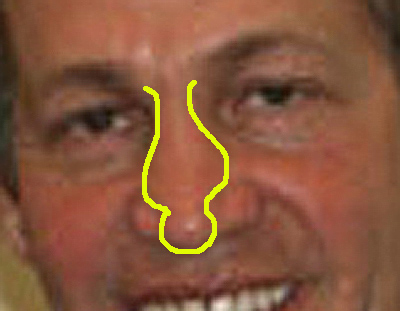
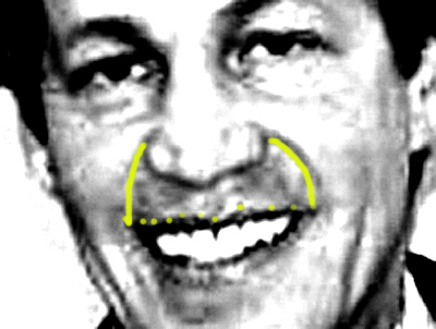
...you can also see above how the nose is taking shape. Time to strengthen your observational skills. I'm seeing Mr. Norms nose as a sort of kerosene lamp shape: it starts out fairly broad at the root of the nose (between the eyes), broadens as you head toward the mouth, then abruptly narrows into the tip - with fairly spherical nostrils winging off to the sides:
Kind of see the kerosene lamp shape I'm talking about?
Next photo:
Trying to maintain pencil contact with the paper. Outlining the upper lids, the iris (the colored part of the eyes) and the drooping eyelids. Also outlined above are the eyebrows. Norms head is slightly rotated so you're getting the "foreshortened" view of the eyes - especially the one farther away. Question: if two objects are of equal size, and one is placed farther away from you, which one will appear bigger? Right! The one that's closer to you. Convince yourself the eye that's closer above is larger than the other one. Next photo: We're cruising along now: I'm integrating the lips and teeth. There's something unique going on with Norm's lips mouth and teeth: yes the two front teeth are pretty prominent, but his upper lip seems to have two very triangular halves to either side of the nasal philtrum (the philtrum is the groove right in the middle of the apron of the upper lip there that runs from nose to lip. It ends in "Cupids Bow". (Use your search function in your Sourcebook to look up Cupid's Bow or the "apron of the upper lip".)
Also exaggerating the teeth here...getting some repetitive smear lines on the lip on the left side of the drawing. Oh well :-). (Be irreverent folks!) In the next stage I've added a contour cheek line - it's an outline of a shadow or highlight shape I'm seeing in Norms actual cheek. There's also a little shadowing taking place on the nose, as well as a lower eyelid added to Norms right eye. Scroll up and down until you see all these additions. I've gone into great detail about all the subtle anatomy, shadows, and highlights common to all faces in the book in the Lesson 15 case studies (especially in Ani DiFranco) explaining all these subtleties. This is dress rehearsal :-)
You can also see the pencil there for scale. Reference this picture below - I've turned the contrast way up in Photoshop to get this effect but it helps to pop out the highlights and shadows. I want you to look back and forth between this picture and the drawing above and make sure you see the the outline I've drawn in the cheek above corresponds to the shadow and highlight outlines you see in the photo below. How else can you sharpen up contrasts and shadow / highlight shape without Photoshop? Did you say squint? You're exactly right! Man you're gettin' good :-)
Can you still see that kerosene lamp in the nose? Squint your eyes and see the shadow shapes in the cheeks and in the apron of the upper lip. I got soft on ya. Here I've outlined the apron of the upper lip. Again, squint your eyes and se if you can't see the shadows and highlights as separate, unique shapes. Capture them on the paper.
As long as we're zeroing in on highlight and shadow, squint and see if you can't extend what you just did above to this picture:
(Note the dark shadow shapes around the eyes) In this next step, I've started outlining and hashing in some of the shadow shapes on the side of the nose, under and around the eyes. I've also started adding the chin and jaw:
Scroll between this sketch step and the photo above and see if you can't find parallels between the shape if drawn shadows and what you see in the original photo.
Next step: after getting close to an outline shape I've begun again drawing the shape of the shadow and then hashing it in. Scroll between this and the step above and see again if you can't put your finger directly on the progress or changes made between the two. This is great for building your observational powers:
Note the lines that designate wrinkles in the lips too. Your job now is to keep comparing progress between photos.
Next: notice how the part of the jaw closest to you is the larger part of the jaw? That's foreshortening working for you:
I'm holding you to what I said above about finding the changes :-). Can you see the progress between the drawing above and the next one below? I'll tell you in a jiffy but it's your job to find the progress first. (Give it the old college effort :-)
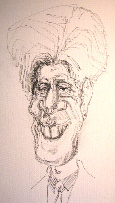
OK, did you try? Look along side the cheeks and where the dimples would be: just more deepening of shadows. But notice how that makes the picture jump out more? Also look above his left eye (right eye as you look at the paper). See what's changed? Can you describe the lines? the overall shape? Take your finger or a straw or a paper clip and trace the shape right on the computer screen. This is a great exercise.
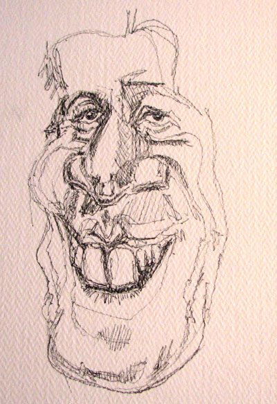
Hair! Adding the big hair
Big hair always pushes me to force the forehead smaller. Look at the photo above, then scroll down to the next drawing:
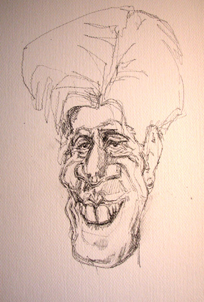
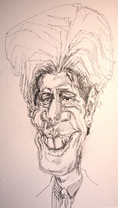
Norms got BIG hiar! I try to see the main edges within the hair - the subtle lines between folds, you don't have to draw all of them, just enough to get a feel. Also compare the proportional changes between the photo and the drawing. In terms of forehead width, how many of the skinny drawn foreheads could you fit in the whole width of the caricatures hair? Go back to the original photo of Norm and compare the overall hair and head width compared to the width of the forehead. I come up with the hair almost 2 times as wide as the forehead in the phot. In the caricature I find a ratio of 3 and 1/2 foreheads to 1 head of hair at it's widest. Prove it to yourself. Next step: darkening along the border between hair and face, adding a neck, shoulders, shirt and tie:
What's changed between this next step and the step above?
Did you say more filling in in the neck, under the chin and on shirt and tie? Correct! :-)
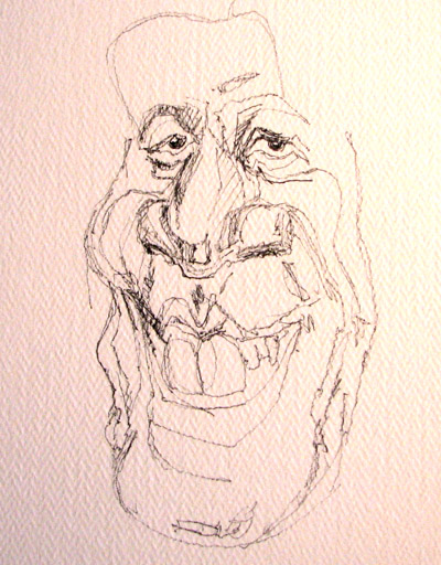
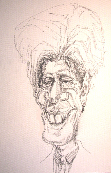
Last step: I erased a one layer of dimple on the left side of the drawing. Can you see it? I though that might make the likeness a little closer. Did it help? I can't say.
All in all, I like this drawing :-) I just think I could catch a much better likeness of Norm if I did another drawing. And I might do that in the next issue. One of these days I want to start drawing and then painting the drawing in watercolor. Might you be interested in that? Let me know. Moreover today though, I wanted you to use and exercise your powers of observation. Observation is the key to drawing anything. Observation and drawing. And drawing, And drawing. Yes you can learn the 5 skills of drawing in rapid succession, but to really get fluent in those skills you have to use them. That's all for today ya'll! Keep on drawing and see you soon.
Warmly, Jeff
Kasbohm & Company's Drawing-Faces-and-Caricatures-Made-Easy.com and © Copyright, All rights reserved 1997-2006 |