| Caricature and Drawing Newsletter for May, 2007
This newsletter is reproduced here courtesy of YouCanDraw.com -
Once and for all getting you drawing faces and caricatures:
May 2007
Back to the www.YouCanDraw.com Archives
||||||||||||||||||||||||||||||||||||||||||||||||||||||||||||||||||||||||||||||||||||||||||||||||||||||||||||||||||||||||||||||||||||||||||||||||||||||||||||||||||||||||||||||||||||||||
Your May 2007 YouCanDraw.com Communiqué
||||||||||||||||||||||||||||||||||||||||||||||||||||||||||||||||||||||||||||||||||||||||||||||||||||||||||||||||||||||||||||||||||||||||||||||||||||||||||||||||||||||||||||||||||||||||
Howdy all,
1) Member / alumnus and NYC caricature star Elgin Bolling is at it again folks :-) He just sent me the results of his latest efforts and you can see them at: www.snidetv.com . Elgin told me in an email he doesn't necessarily agree with the politics of the show but did a lot of research on all his drawing subjects. Basically Elgin did everything you visually "see". Did all the various expressions of each subject, researched all his subjects, drew and illustrated all the set pieces (i.e. all the buildings, trees, cars, background). That's a ton of work! So if you like what Elgin has done, let him know! (You can email him from his site at: http://www.subwaysurfer.com/ ) Keep it up Elgin!
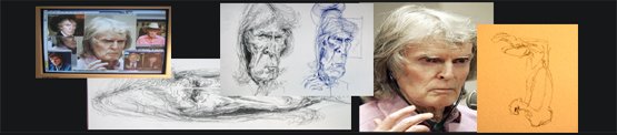
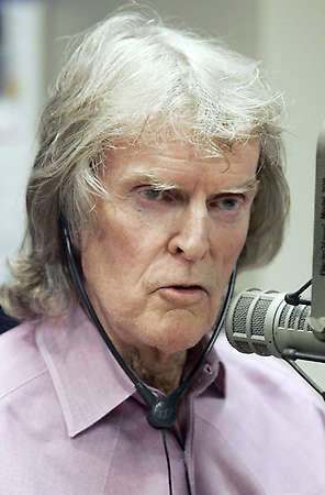
2) And today we're going to Caricature Mr. Don Imus.
------------------------------------------------------------------------------------------------------------------------------------------
Diving right in here...who's in trouble these days? Or at least in recent days? How about that old crank Don Imus? Yep, he's pretty fair game and he's pretty caricaturable too if you ask me. I pretty much keep any detailed opinion I have of someone to myself for the sake of drawing but this guy's just plain a redneck. Sorry, he had it coming.
Yes, there's such a thing as First Amendment rights, and as much as he has the right to say what he wants, we have the right to say what we want about Don Imus. Regretfully in the end it wasn't decency that took him down, it was advertising money - or overnight evaporation of it. I listened to him once by accident and all I could think was who's this guy think he is? Changed the station. Easy to take shots when someone is down but he's still fair game for caricatures at least for as long as he was broadcasting. Enough of my opinion.
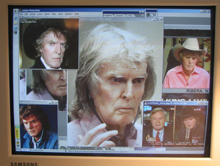
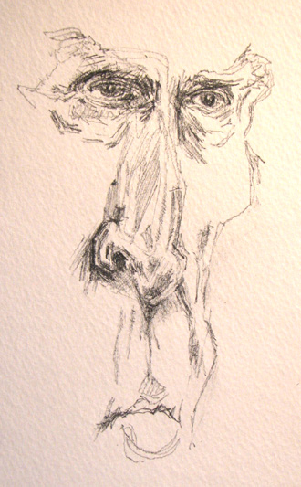
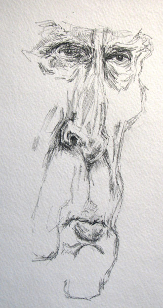
OK, here's my screen full of Imus photos. As usual, if you don't have the person you're drawing in front of you, build a library of reference photos. Between Google Images and Photoshop you can darn near build an instant library:
Just for comparison, here's a shot of Larry King and Sr. Don in a side by side photo:
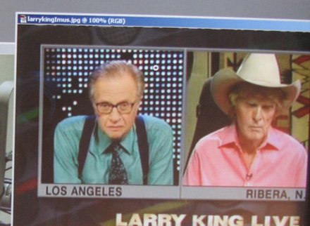
A great thing about a side by side shot like this is the ease with which you can compare things: look at the eyes, the nose, the eyebrows, the shadows in the cheeks, the width of the mouth, the overall length of the face, shape of the head, the hair, the height of the forehead, the neck, the shoulders, the ears, accessories etc. So take a second and compare those things I just mentioned. Go back and forth between the photos and get yourself warmed up :-)
Two more views below:
and the second:
What do I think is caricaturable? Here's a list:
- A fair amount of hair - light, air blown, thinning hair pulled way down to the eyebrows
- Eyes are deep set - in fact the darkest shadows of Don's face are in those shadows of the "palpebral fold" (that's the groove between the top eyelid and the eyebrows);
- Bridge (or root) of nose is narrow, leads it's way to long thin nose - this should be pretty fair game for caricature fodder;
- The nose comes to a round tip, narrow nostrils that curve up pretty sharp at the corners and have again, dark shadows;
- Cheekbones are high, make for very thin, hollow cheeks below the cheek bones; note the subtle shadowing that marks the hollowness there;
- upper lip is very thin, is preceded by a long "apron of the upper lip" - which makes his mouth seem a long way down from the nose; Cupids Bow ("the cowlick" of the upper lip) comes to a subtle point - it's noticeable because the upper lip is so thin - note: as anyone ages, the apron of the upper lip begins to roll down over the upper lip and makes it (the upper lip) seem more and more thin;
- the mouth and chin: relatively small mouth, full, almost pouty lower lip;
- the overall shape of his head is long, narrow, almost angular;
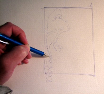
OK, first stop here is to do a quick ink rough. I haven't drawn in a month so I'm feeling pretty rusty. I drew a quick format (a format is a bounding shape or frame I'll try to keep the drawing in -- fat chance:-) I just want to get an idea / a feel of how to draw him:
I started with the the high peak of the hair (not my usual starting point)...and as you can see below, added eyes, lengthening the nose, etc.:
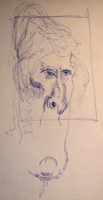
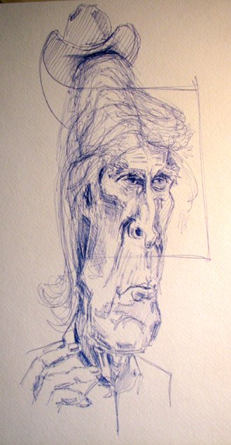
I think the chin got put on a little crooked above - but sometimes really adding a literal twist to things makes for great comedic relief. Just not this time. You can see the overall lengthening of the face there too as well as a few additional skin folds in the neck (both above and below). Below the hand is added, as well as a little cowboy hat. I had about 20 minutes to draw on this first day and the results are sure sending me in the right direction:
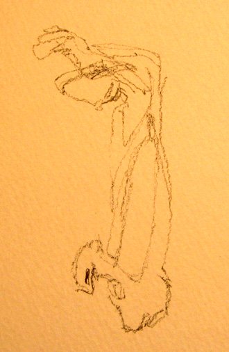
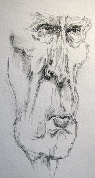
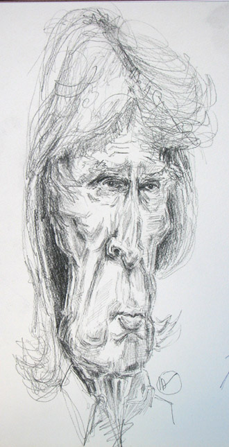
Ok, day 2.Have about 45 minutes to draw on this day. I'm switching to pencil, diving in using the pure contour approach: where the pencil never leaves the paper (you'll need your password for this link). This didn't last long - keeping the pencil on the paper - but I always like the organic feel of this drawing technique. I'm back to the usual stepping off point: the right eye (which is the eye on the left side of the paper), worked my way through the brow, down the nose and outlined shadow and highlight shapes on the nose:
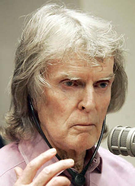
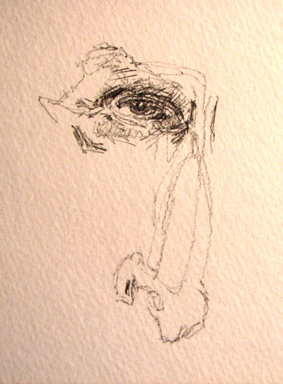
Refer to the original photo just below. Lots of darks around those eyes:
So... let's add some details around those eyes - see how dark that shadow is over the eye and at the corner on the nose-side of things?
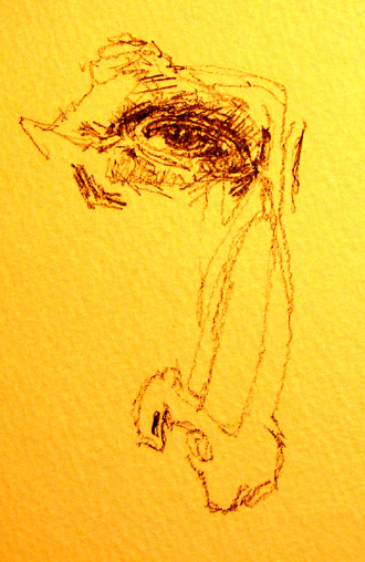
Now I just had to add this photo - it's the same photo as above but for some reason the lighting and the close-up function on my camera (which I literally just discovered a couple days ago) gives the whole thing an Indian Yellow color cast. Weird! But I kind of like it :)
Imus has some really zig zaggy eye brows - and they're mostly white hair. This makes them tough to draw unless you erase them out of a heavily penciled area. Instead I just drew an outline:
Heading down farther south down the face...the left eye got a little to far away from the nose - which makes it proportionately, well, farther away from the nose than it ought to be - and deeper in the head than it ought to be. But I'm fighting the clock here so I'm going to keep on going. Lots of lines that add up to a shadow around that nostril there too.
Note: where ever you have a dark shadow on a curved surface, you almost invariably have a highlight just before the darkest shadow. Why's that? Well a curved surface - as it curves away from the light source - eventually curves around far enough to start picking up reflected light off things that that aren't even in the picture. (More on shadows and highlights.) Look on the side of the nose - right on the nostril - for this phenomenon. See how realistic that looks? (Even if we are drawing a caricature):
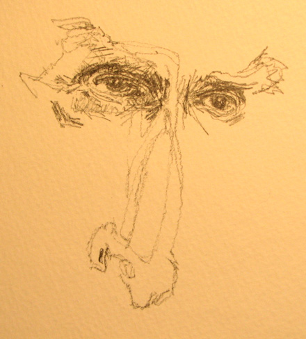
Next picture below: compared to the step just above, that upper lip needs some tightening and some rotation in a clockwise direction. This is more Don Imus-like too. Compare the mouths above and below and see which is more Imus like:
Here's the original photo for comaprison:
Below: adding more shadowing in the loose skin around the mouth and at the corners, adding the cheekbone (notice the light / dark rhythm in the cheek bone shadows - it's the same effect I mentioned above when I was talking about shadow and highlight on a curved surface). The chin is much more centered than on the ink mock-up above. Also, the jaw line is added too:
More messing with the jaw line here above. It was too much, so I erased and narrowed it more as you can see in the below step (make sure you can identify the changes):
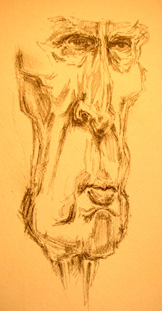
...quite frankly, I think I added too much lead at the jowl below. But that doesn't stop me: I just kept on adding lead. Oh well... I might get around to cleaning it up a little later:
Lets add that forehead - which is pretty much buried under all that head of wispy hair. Wrinkles added to that forehead, more neck and shirt collar added too. I'm really rushing the hair. I'm out of time and it's going to take forever to get in a really detailed hair piece. So I apologize for that. But overall, he's shaping up ok.
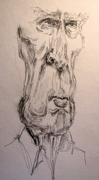
And on with that hair! He sports a 25 year olds hair shape - something of a mullet too. If you look back a the the original photo, notice how there's a large wing of hair that pops out from behind the left cheek. I almost missed it - but - after flipping the photo over in Photoshop I had to ask "what's that shape?" and I realized it was more hair. Some things are just invisible unless you learn to use different techniques for observing (like flipping things upside down):
Yep, that little wing there. Believe it or not, it became invisible - probably from staring at the picture for 45 minutes while drawing it. So as I've said three months in a row, always try to step away form your drawing every few minutes to get perspective. (Of course, I'm a hypocrite when I'm trying to finish something in one sitting. But when I can relax, I always step away for perspective):
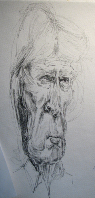
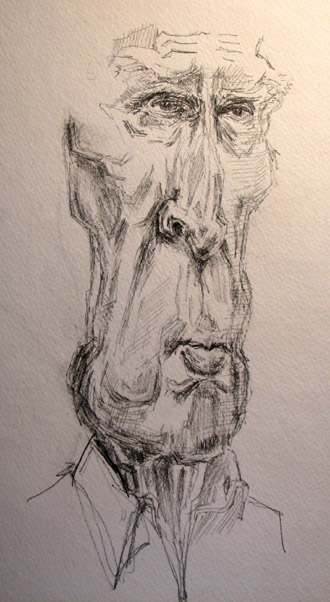
And now, you can see the pretty much completed pictures side by side (on the same page of Strathmore 140 pound watercolor paper - I like the tooth in the paper - and I can add color washes too. The paper will hold up. What's a wash? It's a transparent watery mix of watercolor paint that adds tone and color to the picture.)
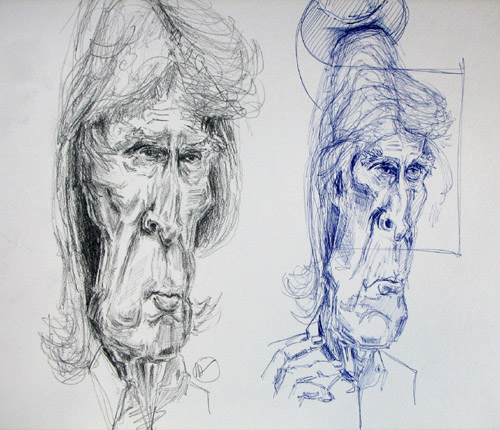
...and a slightly larger one:
Comments: The hair needs a little finishing, but today I just plain don't have the time - but you can get an idea of which way it's going. The state it's in looks pretty amateurish. Oh well :-) (You can still be an artist even if your latest work isn't up to snuff. The point is to keep drawing, writing, making music, etc - whatever it is you do!) I think the shadowing got a little dark between the hair and the jaw line but that could easily be resolved with some scratching right into the paper with an exact-o knife. Doing that would look like white hair breaking up the dark shape. (You can hack right into the paper and not destroy the picture when it's extra heavy like the watercolor paper I'm using here... or you could just erase some of it out :-)
Also, the darkest darks in the hair and in the shadows aren't reflected (i.e. duplicated) in the rest of the face. This can sometimes give you a disconnected look. Again, easily remedied - and obvious - if you take a step back when you start feeling cross-eyed :-). A shadow on the fairly non-existent left nostril (his left) might make his nose appear straighter. As it is, it makes the middle part of the face appear more rotated away from us than the rest of the face. The left eye got a little dark and as I said above strayed a little too far from the midline (i.e. the center of the face).
Your assignment: go back up to the picture just above (where both the more detailed pencil version and the rapid fire Bic Pen version are side by side) and compare and contrast all the main features and shadows, lines and edges. See if you can't come up with finding even very subtle differences. This will give that astute observation muscle in your brain a good little workout. I snipped the table below from the last email but it'll work as well in today's assignment:
Compare every feature of the face you know of and ask yourself how are they different and how are they the same, for example:
- Which proportionately has the bigger nose, eyes, ears, chin, cheeks, neck, tie, collar, forehead,
- Where are the deepest shadows in either picture?
- Where are the brightest highlights?
- Is there anything similar about the highlights and shadows in the two drawings?
- Who's head is longer? Who's is wider?
- What part of the face is widest in each drawing?
- Can you visualize the a) middle of the eye line b) the bottom of the nose line c) the middle of the mouth line and d) can you strategize how you'd exaggerate even more?
Very cool! Now do 15 minutes of drawing. Get your timer. Draw one of the snap shot drawing above. Draw as much as you can in 15 minute. Use whatever paper or drawing pen / pencil you have right in front of you. 15 minutes, no excuses. Just do it :-) Now. Go. |
OK! Over and out for now. Keep on drawing.
Warmly,
Jeff
--------------------------------------------------------------------------------
Kasbohm & Company's
Drawing-Faces-and-Caricatures-Made-Easy.com
and
YouCanDraw.com
© Copyright, All rights reserved 1997-2007
|