|
When drawing caricatures, learn to zoom in for subtle details......and glean the essence of a persons distinctive look by doing serial sketches. Caricature and Drawing Newsletter for This newsletter is reproduced
here by courtesy of YouCanDraw.com - |
|
Howdy all! Well in today's newsletter I did something a little different -- not a whole lot, just a little. What did I do? I just went about drawing a local (Minneapolis, Minnesota), well known sports casting celeb: a Mr. mark Rosen. Mark has been an announcer and commentator on the Minneapolis sports scene for probably, well like two and a half decades. Pretty dang impressive. In fact this guy is not on just TV, he's on local radio and in print around here. (Does that tell you how great he is? Or how big Minneapolis is? :-) Either way, with his always smiling yet incisive perspective and biting commentary, this guy never seems to get into an emotional flap - no matter how hot the barbs get thrown. At least not on the air. And I guess when you're a 6' 7" former pro jock (actually I'm not sure if he ever went pro but it sounded good to say that) you don't have to get into flaps. Except with maybe the good natured local ex-Viking defensive tackle and behemoth Curtis Rouse - all in fun of course. What I'm getting to is he's as affable as his picture suggests. And today he's our drawing subject, ripe for caricature.
|
So here's Marks mug shot from Minneapolis Channel 4:
http://wcco.com/people/local_story_317145151
(Copy and paste this address into your browser.)
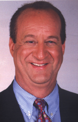
Mark Rosen: Minneapolis Sportscaster
Let's dive on in: what makes Mark caricaturable?
| The Hair. From the top
down, it's always an easy cheap shot to hit guy where it hurts: but if
it's the truth, it must be known. Mark's losing a little bit of his hair
on top. And if you look close, you can see some fuzzy loose ends. Just set
that observation aside on your mental list of details to exploit. A lot of
guys start getting that little left over plot of hair in the middle of the
forehead - a vestige of that hair lick that came down front and center
over the nose. In middle age, it often becomes more of an island than
anything else.
The Forehead. Mr. Rosen - since the hair has receded - shows a lot of forehead. This is always a conundrum for me because when you have a dominating lower face (the face beneath the eyes) fighting with a large forehead, which do you zero in on? It's a conundrum until you remember the brain doesn't need a forehead to recognize a face. Yes, strange neurologic fact, but true. I've mentioned this all over the place on the book so I'll mention it again here: foreheads are expendable in a drawing (unless they're so incredibly notable or you're doing a strictly realistic drawing. We're caricaturing. But, I have discovered a way to remedy this situation (when someone has lots of real estate above the eyes and has a dominant lower face as well. Watch below for this)...
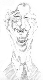
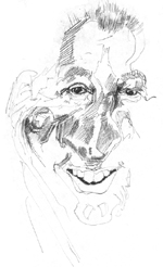
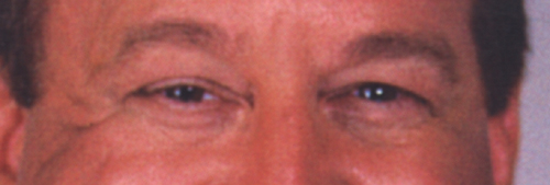
In this first picture, I dove right in and started drawing because I knew I had to get this picture rolling for the newsletter. (You can click on it to see a much larger and more detailed drawing.) You can see how I handled the hair -- notice the two rows of hatching that represent the thinning hair -- and the loose ends.) I'll comment more on the individual pages for each larger drawing...so click on the picture above for that :-) The Eyebrows. Mark's eyebrows are fairly light -- especially when compared to his dark eyes. That becomes an important consideration in the overall composition of the picture: the greatest contrasts in color and light / dark become the focal point of a picture - and if they're not, they oughta be. When you look at people the eyes are always the most intense part of the face, so it takes a lot to bring the focus to another part of the face. (Makes me think if Colin Farrell or Governor Michael Dukakis and presidential candidate -- they both have eyebrow's like the Sherwood forest, and they (the brows) still playing second fiddle to the eyes. All I'm saying is don't fight it. OK. So Mr. Rosen's brows are kind of high floating in this picture (because he's a happy guy :-). That leads us directly to the eye's themselves... The Eyes. This guy's eyes are just plain happy. He's doing what he loves and gets a kick out of it. (And this is how he appears every night on the news.) So the photo really does capture the guys personality. What's notable specifically are the high riding lower lids that almost occlude the iris (the colored part of the eyes). Add to that upper lids that come down pretty far from above, and you start getting the feeling he has small eyes. Are they that small? No, it's just that they're partly hidden. That's all. Look close too for the highlights within the eyes: there's two bright ones in his left eye (that's the eye on the right as you look at the picture):
Other notables around the eyes: check out the number of secondary lines beneath the lower lids there are. Not to worry, this will happen to you too if you live long enough (and smile enough :-) The lower lid lines (also called infraorbital folds), blend at both corners of the eyes with the crows feet towards the temples and at the "medial canthus" towards the nose. Note also the two dark lines in the upper lid just above the actual eye - most notable on his right eye (left eye as you look at the picture). Can you remember what that fold it's called? Right! The palpebral fold. (If this anatomy is getting a little too in-depth. make sure you revisit the huge boot camp and Flash Lesson on eye anatomy: Drawing Eyes Boot Camp.
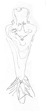
See how master caricaturist David Levine treats these lower lid lines: |
| The Nose. Ok, Moving
on...Now we're getting onto more complicated territory here. This is
subtle but if you look close, you can see there's just a little curve to
the nose. I mean, who's perfect? Think of Harrison Ford. He's got a bit
of a right curve going and that's perfectly normal: very few people have
perfect symmetry. And that brings up a very important point: asymmetry.
Since few people (if any - movie stars included), have perfect symmetry
in their faces, learn to spot the very subtle asymmetry in people's
faces.
Now that's totally different than "imperfection" because everyone is perfectly who they are. And when you discover the asymmetry in a face, and you capture it in a caricature, it'll make the difference between a good caricature and a fantastic caricature. Your ability to spot these subtle things comes with patient and astute observation. For fun, scroll back up to the eyes above and look at all the differences between the left and right eyes. (For instance look at the lines and shadows in the upper lids. It's remarkable! Phillip Burke is a master at exploiting asymmetry.) Click on the button just below to see some of his samples - glance at Prince or Jerry Garcia to see some really far out paintings. They really exemplify Burkes asymmetric style... |
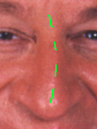
| More on the nose. Mr. R's nose may well be his most
dominant feature next to those smiling eyes. If you follow the rules for
laying out the horizontal landmarks, (check
out this free download lesson on the horizontal landmarks from the
YouCanDraw.com on-line version of the book - for Windows only right now),
i.e. where the center of the eyes fall on the average face, and where the
bottom of the nose lies in relation to the upper lip, it'll become clear
his nose comes very close to the lip -- a little and as bulbous as this particular
nose appears, it's down-pointing demeanor outweighs it's
bulbousness.
In fact, that revelation becomes apparent in the next quick sketch I did - the one where the cheeks become much more of the dominating contour in the upper face. "Dominating contour"? Well, dominating after you land on them after cruising down the upside-down pear-shaped forehead. (Please don't be offended Mr. Rosen if you ever read this, but you have to remember we're talking about how to exaggerate faces :-) Yes I'm jumping around a little, but frankly I was pretty dissatisfied with my first attempt at drawing Mr. Rosen. I needed to capture a blueprint, something to aim towards. A shell of a design, a rarified outline that captured the general overall exaggerated shapes of his face worth caricaturing. Here then was the remedy to that need:
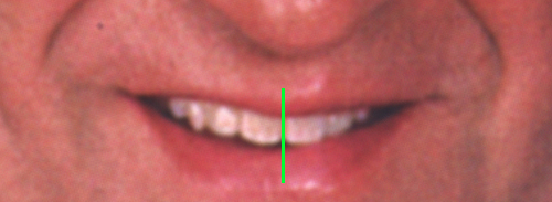
It's a thumbnail, but it worked. It set up and captured the general overall shape of the head and neck that I could then fill with more detailed features. You can also see in this thumbnail version how the nose thoroughly dominates the mouth. And speaking of the mouth, can you see the asymmetry again? Yep it's subtle. But if you draw a line down the middle of the mouth right between those "incisors", you can easily see the difference between left and right halves:
How do I know there's that much asymmetry? For instance, count the teeth you see to either side of the yellow line. One side has three teeth, the other displays four. Observe the space between the upper and lower lips on each side, and ask yourself "do the teeth touch the lips at any time?" I know, may seem nit picky right now, but it's in the details that the personality is really revealed. (There's no way for you to know this unless you watch this guy on TV in Minneapolis, but he talks out of one side of his mouth a little more than the other. So it's not a fluke it shows up in a snapshot like this - it's definitely part of who he is.) From Cheeks to Chin. I mentioned a little about the lips above, (there's more on few of the larger picture links). The cheeks seem to dominate the area just below the eyes, the nose brings us right down to the upper lip, and the mouth tapers into not just one chin, or two chins but three chins. What a great thing to get draw! (Actually the "third" chin is really more of an extra wrinkle that starts mirroring some of the shapes of the chins above it.) OK, what did I draw so far? I did the first kind of over-detailed version that didn't really look like Mr. Rosen at all. Then I went back to really identify what makes him caricaturable. At that point I came up with the very rough line-drawing thumbnail above that got us a little closer to what a good caricature might look like - it was an overall shape-to-model version. Now, armed with a shape to aim for, I did a third drawing. This one starts filling in a little more detail than the first thumbnail, plus I lengthened the neck some. Here's that version:
Hey, not too bad! :-) And even a better Randy Quaid! But getting closer. I'm going to push it some more. This version was better than the first thumbnail but something in the eyes and in the mouth weren't hitting it. (click on the picture for both a bigger picture and a few more notes on what made work / not work).
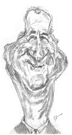
The fourth version, well, it's getting a lot closer: check it out:
So the fine tuning is starting to work. I'm still not happy with the eyes, and the mouth and teeth are a little too John Wayne-ish. So what's a guy to do? Well frankly, I'm pretty happy with this fourth drawing, but, I want to really nail this one down. Why? Because I'll be submitting to the local papers in exchange for the green stuff and I want to do a large -- like 4 to 5 foot tall painted version of the finished product that I'll shoot for getting several thousand dollars for. I'll keep you posted on the details.) I may do one or two more -- and for sure push the Randy Quaid likeness.
So that's it for today folks. Watch coming newsletters for the finished product / exaggeration. Stay well, stay brave and keep on drawing! And happy Cinco de Mayo! Warmly,
Jeff
Kasbohm & Company's Drawing-Faces-and-Caricatures-Made-Easy.com © Copyright, All rights reserved 1997-2005
|